Header options
Header and title section are the most important part of your website. It will determine if your visitor stays or bounces somewhere else. This is the place to wow your audience. There are many styles and options to go through, what shows the best side of your business?
Regular Menu
Regular menu can display your logo and fit a small amount of menu options.
Your logo can’t be too complicated with the limited amount of room.
And of course, all menus are mobile responsive

Inline Menu
The inline menu is similar to the regular menu, but with your logo prominently displayed.
There is a little more room for more menu options.

Center Menu
Center menu is like the inline, but with much more room for the logo. This is great if you have an impressive logo to display.
There is a lot more room on this header for menu items.
The downside is how much room this menu will take on the website. If brand recognition is the most important factor this is a good option.

Hamburger (2 options below)
Hamburger menus are a lot different from the previous options. This is similar to how the menu will normally appear in the tablet and mobile view.
If you want to keep everything uniform, this is the menu to use. The options on how it opens are below:

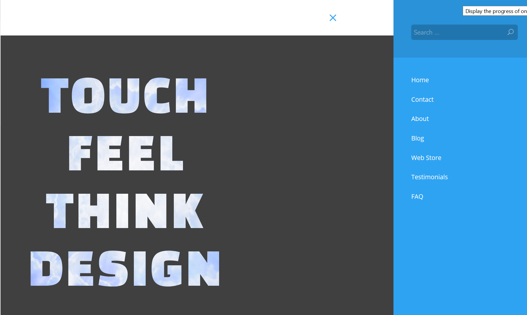
Hamburger Side
The Hamburger Side Menu is a stylized menu that shows vertical options. The logo will leave the screen and hide while this is up.
If you want a unique look for your website, this will do it.

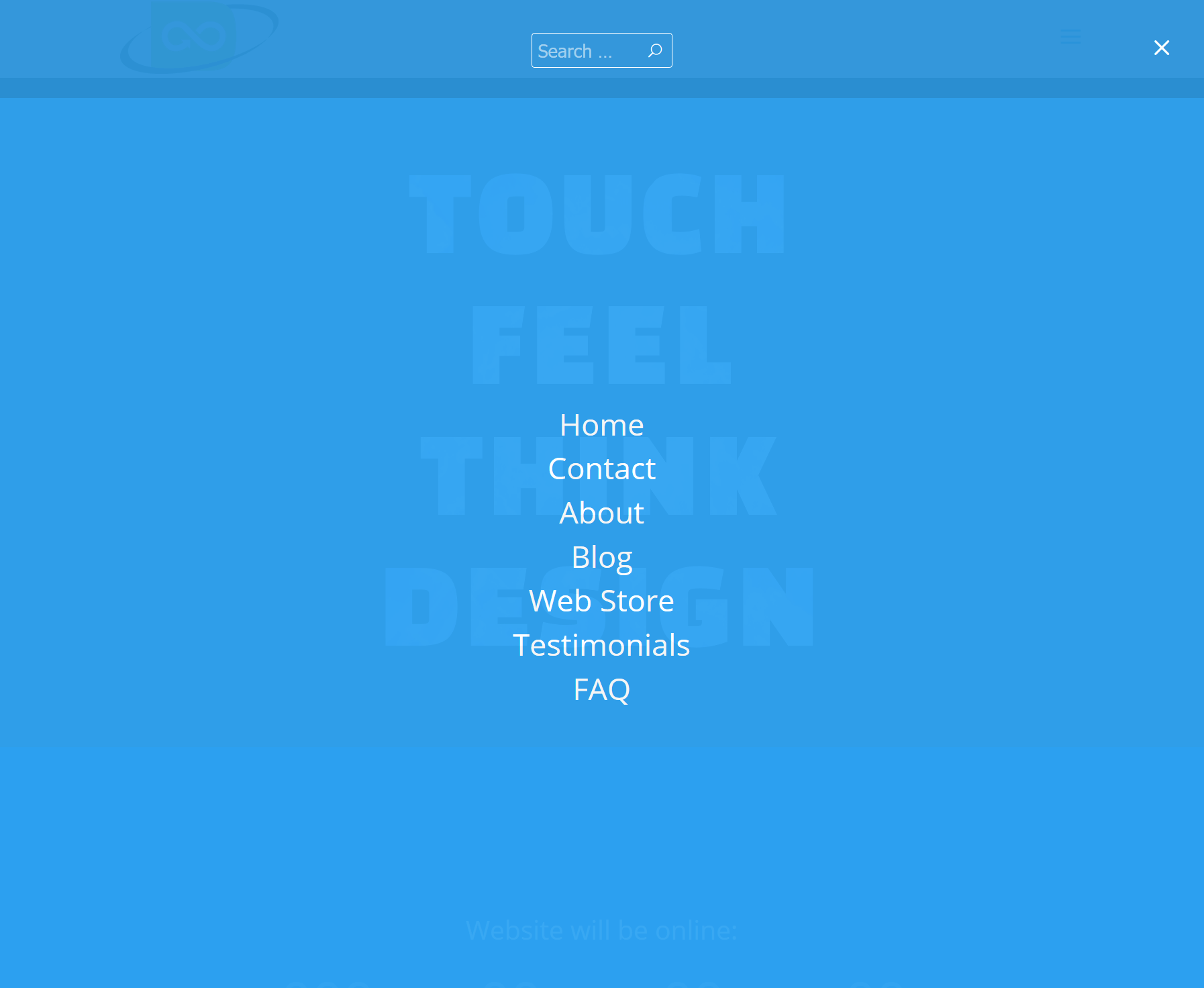
Full Hamburger
The Full Hamburger Menu is similar to a tablet or mobile menu. There isn’t much more than the menu occupying 100% of the screen.
If you can afford to ignore desktop users and just go with Tablet and Mobile users, this is a great menu option.

Secondary Header
The secondary header is just a smaller optional bar above the normal header. It’s usually a secondary color. This is a great place to put a phone number, email address and social media links.
It’s recommended to keep the header simple. Too much information is a big turn-off to new people.
As with most options available, the colors size and fonts can be changed to match the feel and flow of the website. Generally the header is nothing new and is not what attracts attention. That will go to the title section.
