Page Layout
Lets get on the same page. Now we’re getting into the look and feel of your website. The page layout doesn’t matter as much as the content, but it will change the overall flow of your entire website.
Anatomy of a website
A website is a lot different from a document in that designers spend a lot more time in the spacing of everything. Here are some terms so we’re on the same page.
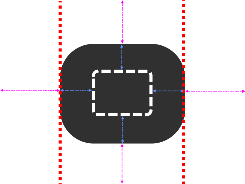
The red bars on the side is called the gutter. This should be consistent throughout the website. If you want to add a background or color to the gutter, this is called a ‘box’ layout. Made popular in 2008. Not the current style, but you can still make it work.
The dark color is the section, module, div or row (Yea, they mean different things but in this context they’re interchangeable). That will hold the content, it doesn’t have to be colored, most of the time it is invisible.
The white bar in the center would be the content itself.
The purple area is the margin. This will push other content away, adjusting where it sets on the page. Margins change the space outside the content.
The Light blue is the padding, this can increase the size of the content itself.
The only thing you need to get out of this is this: Padding and margin distances should be universal throughout the whole website, this will make it uniform and clean.
Like a child’s dinner plate, elements should not be touching.
Layout Options
This section is full screen and has zero gutter. It goes from the edge to edge. If you have a lot of big pictures on your site, this may be a good option to just go full screen. I’m having the text go to the edge as an example, normally you’d have a little padding on all sides.
Lorem ipsum dolor sit amet, consectetur adipiscing elit, sed do eiusmod tempor incididunt ut labore et dolore magna aliqua. Ut enim ad minim veniam, quis nostrud exercitation ullamco laboris nisi ut aliquip ex ea commodo consequat. Duis aute irure dolor in reprehenderit in voluptate velit esse cillum dolore eu fugiat nulla pariatur. Excepteur sint occaecat cupidatat non proident, sunt in culpa qui officia deserunt mollit anim id est laborum.
The gutter is not fixed but adjustable.
Lorem ipsum dolor sit amet, consectetur adipiscing elit, sed do eiusmod tempor incididunt ut labore et dolore magna aliqua. Ut enim ad minim veniam, quis nostrud exercitation ullamco laboris nisi ut aliquip ex ea commodo consequat. Duis aute irure dolor in reprehenderit in voluptate velit esse cillum dolore eu fugiat nulla pariatur. Excepteur sint occaecat cupidatat non proident, sunt in culpa qui officia deserunt mollit anim id est laborum.
Full Screen with a gutter. The recommended to put your text if you decide to go with a full page look.
Lorem ipsum dolor sit amet, consectetur adipiscing elit, sed do eiusmod tempor incididunt ut labore et dolore magna aliqua. Ut enim ad minim veniam, quis nostrud exercitation ullamco laboris nisi ut aliquip ex ea commodo consequat. Duis aute irure dolor in reprehenderit in voluptate velit esse cillum dolore eu fugiat nulla pariatur. Excepteur sint occaecat cupidatat non proident, sunt in culpa qui officia deserunt mollit anim id est laborum.
This is the current style is to have empty space on both sides of the content.
Lorem ipsum dolor sit amet, consectetur adipiscing elit, sed do eiusmod tempor incididunt ut labore et dolore magna aliqua. Ut enim ad minim veniam, quis nostrud exercitation ullamco laboris nisi ut aliquip ex ea commodo consequat. Duis aute irure dolor in reprehenderit in voluptate velit esse cillum dolore eu fugiat nulla pariatur. Excepteur sint occaecat cupidatat non proident, sunt in culpa qui officia deserunt mollit anim id est laborum.
If you’re interested in styles and trends, head to the ‘styles‘ page.
Column Options
Due to the mobile friendly nature, there are a few limits on what we can do on a website, ignoring these can kill 75% of your potential traffic.
100% or 1
1/2
1/2
1/3
1/3
1/3
1/4
1/4
1/4
1/4
2/3
1/3
1/3
2/3
1/4
1/2
1/4
1/4
2/3
1/2
1/4
1/4
These are just an example, there are a lot more options. The blue background is just to show you how the content will sit. Mobile sites will just stack these on top of each other. Most of the time, each column won’t have separate colors, and it’s just how it rests on the page.
One-page site or many?
There are a lot of advantages for a single page site. It comes down to this: If you don’t have a lot of content, a single page is the way to go. If you have a lot of content, it’s better to have as many pages as needed. But it’s also very important to make your site easy to navigate.
As with most options available, the colors size and fonts can be changed to match the feel and flow of the website. Generally the header is nothing new and is not what attracts attention. That will go to the title section.