Styles
We’ll briefly go over website trends.
See the rounded edges of this section? The more rounded a section is, the friendlier it can appear. Square edges are a lot harder to make look more professional. Just a tiny bit really makes a good difference.
Lorem ipsum dolor sit amet, laudem libris aeterno ei vim. In pri posse mucius concludaturque, nec idque scripserit ad, eos an modo pericula. Usu id iusto tractatos dissentiunt, scaevola convenire maiestatis est id. No ius gloriatur pertinacia, ius singulis tincidunt at, id consul malorum nec. Te vis elitr ornatus, saperet laoreet ei pri, erat conceptam accommodare sed ad.
There is a good balance on rounding edges off. When you have very rounded edges that look very circular, it becomes child like/friendly. No sharp edges, but something safe. Good for a child oriented business.
Lorem ipsum dolor sit amet, laudem libris aeterno ei vim. In pri posse mucius concludaturque, nec idque scripserit ad, eos an modo pericula. Ad sint pertinax pri. Te mei purto primis, omittam periculis pro ut, eum ad fabellas interpretaris. Fabellas oportere adversarium sea ne, an docendi alienum has. Tale erat gubergren ea per, eu prima laudem aperiam sed, at mei solet phaedrum. Cu alia insolens his, saepe oratio ad mel. Ei quas atomorum cotidieque vim.
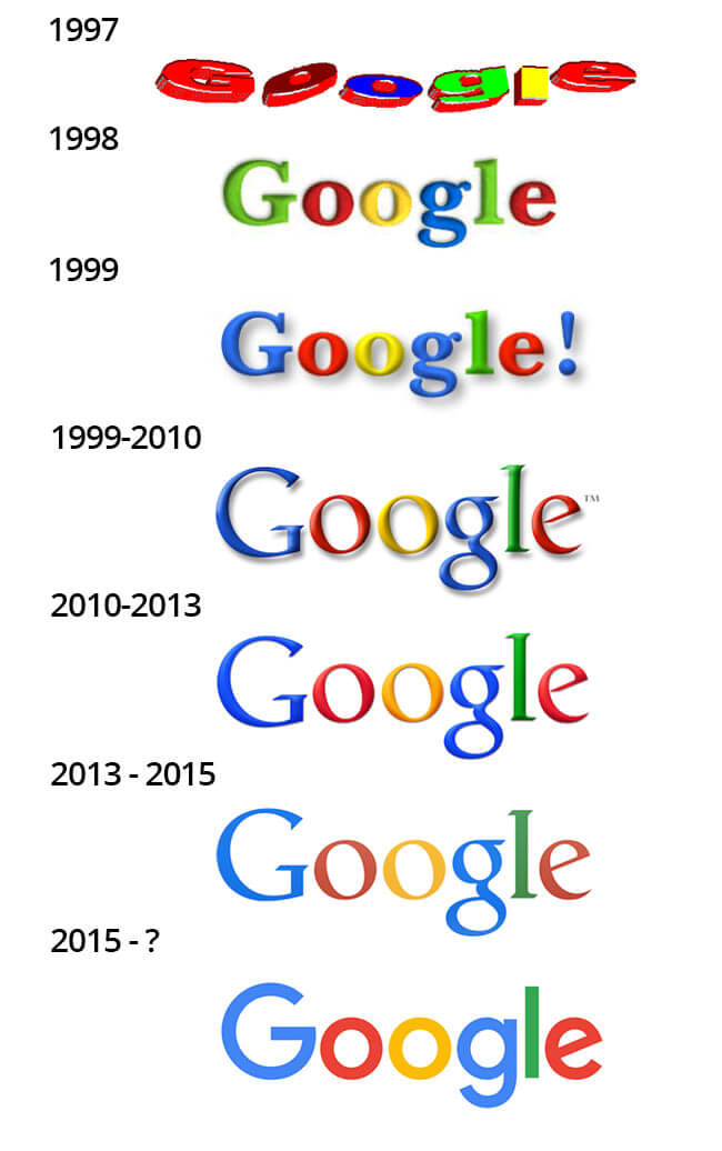
Take a look at the Google logo. This is a really good example of how site trends have changed over the years.

Notice how the logo has lost detail as time has gone on? Shadows have come and gone. This has really changed with web culture, too. Less is more in terms of keeping people on your site and staying.
Uniform
The most important thing with any style is to keep everything uniform. This includes font, spacing, colors. Just keep it consistent. This is the main difference between an amateur and a professional looking website. Most people will say that the website just looks ‘off’.
Footer
A footer is a small part of the website, usually a different/darker color, that goes to the very bottom of every page.
Need a legal notice? That should go in the footer.
Need an accessibility page? Very visible in the Footer.
Need a copyright page? Yes the Footer.
Have some social media icons you want to display? Actually keep that OUT of the footer unless you can’t put it anywhere else.
Try to keep as much out of the footer as possible.
We will be putting our company as a no reference link (Telling search engines to not count the link and ignore it).
Most people ignore the footer, and it’s best to not put information people need there
It’s fine to guess new trends, it’s not OK to use antiquated ones.
